On my assignment I was told I don't need to fix anything. So I must of got my idea across and while doing so made my piece look good.t
|
I think the most promising thing of this work is it's interesting shapes. One thing I think I need to is add color but I don't know how to make it relate to my idea. So my main problem is to find how to incorporate color. I'll solve this by finding a way to make a design that relates to my idea. Yes, to add color because it's to plain the way it is now.
I used my lines most to create interesting shapes to keep the audiences look longer. I think the things I used added meaning by making it look more complicated than it really is. The main risk I took with these was morphing the lines which makes it look like one object but make it interesting.
I think the most I grew on was my ability to look at an object and see how I can create a good change to it. If I could start again I would change the chain to make it more real, but then again I like how it looks now. The goals I had were met on this piece easily just looking at it I can tell I did well on it. I chose to present it like it was art not a false picture. The biggest risk I took on the was the clock by having the three different times and it made my piece become very successful.
One thing I was told to fix was to make the drawing to look like it was actually resting on a table not floating. So now that I fixed it it looks like a real object not a drawing.
For my drawing I decided to draw something that hits home for me, which is a game controller. While thinking up this idea I decided to look for good drawings of negative space and in doing so lead me to Tang Yau Hoong. I found an image and it jumped out at me and I thought I want my drawing to be as intresting as his when you look at it. So when I thought of doing this I came up with a few sketches to make it intresting like his. So the thought came to my head, just like a game controllers cord life has its twist and turns. 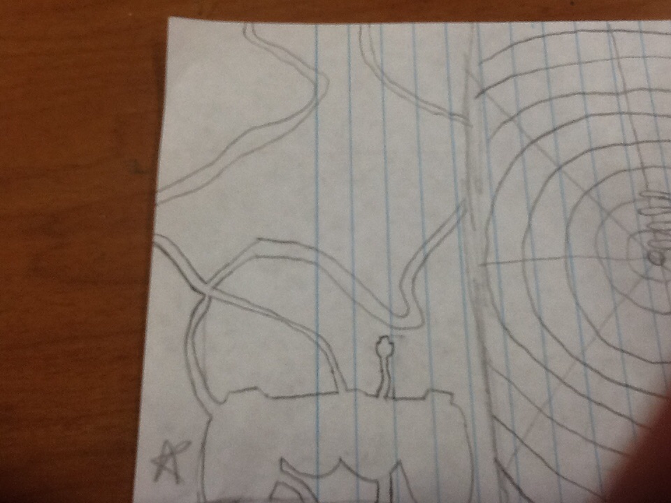
When starting the project everything went smoothly even the clock but one thing I did not like is when I got to the chain. For the chain I dicided to make it look simple so it would make the clock come out more but the problem was I had to draw a ton of circles which made my hand hurt but in the motion I had it in the draft. So what I did is I drew a light line for the path then drew the dark circles on top which to my surprise actually worked. Another thing I had a tough time with was drawing the perfect circle for the clock. The reason it was so hard was because I had to draw three circles that were perfect all around each other but, that wasn't the hard part the hard part was trying to get that old compass to actually draw perfect circle without changing the size halfway through.
The way I'm going to get my idea across is mainly with the clock part of the watch. Like I said in my earlier post I'm going to show the time used to draw it but there is a twist to that because it will be the only part of the watch with color everything else will be black and white. I'm also going to draw a design in the door of the watch to bring your eyes to the clock. That's why when doing this drawing the clock will not be in the middle of the drawing because that will make the drawing worse. So the only real risk I'm taking is the thought of trouble of getting th
What I'm going to do for this project I'm going to use my pocket watch as my canvas for my creation. This picture below is what the picture is going to look like. One artist who helped me with this idea was JD Hillberry. The reason I used him as reference is because he does extremely well pencil drawings of real life objects. After coming up with a couple ideas the one that spoke to me most was the idea of time on how time is to precious to be wasted away. With the drawing I'm doing I'm going to draw three separate times in the watch different color to represent how much time it took me to do the drawing. 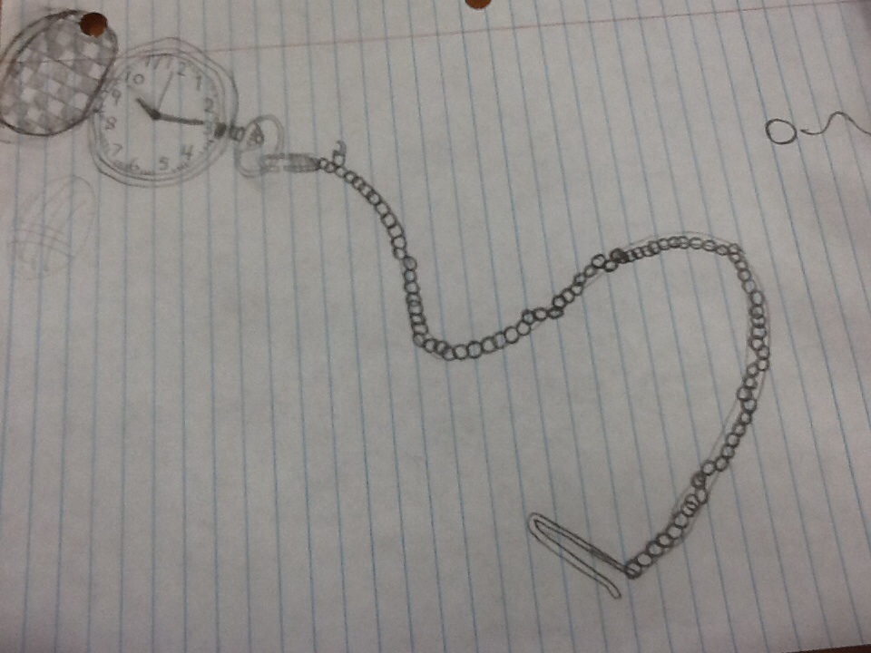
At first when I started my pre-test drawing of my hand I was nervous that I wasn't going to draw it we'll but it actually turned out well. One thing I noticed I was paying attention on was the small details like the creases in my palm and such. One conflict I realized when drawing was I need to get better at shading because after a while my drawing is really darkened. I solved that problem a little bit by making the parts in light not shaded at all. When drawing the upside drawing it was easy for me to enter r-mode because that's how I naturally draw so instead of seeing it as a upside horse I saw the lines as they were curves and shapes not features for a horse. But the biggest success I got out of this was details to the small things.
|
